For ten years, the UK's walls have looked the same: pale prints in thin frames, Scandinavian-beige everything, art that whispers when it should shout.
The Minimalism Hangover
We're not knocking minimalism entirely. It served a purpose. But somewhere between the third "live laugh love" canvas and the forty-seventh abstract beige watercolour, British home decor lost its nerve. Walk through any homeware shop on the high street and it's the same muted tones, the same safe choices, the same art that could belong to anyone and therefore belongs to no one.
2026 is the correction. The pendulum is swinging back toward colour, texture, personality, and art that actually means something to the person who hung it.
What Is Brutalist Bollywood?
It's a design language we've been building at SpicyEditions since day one — though we only recently gave it a name. Here's what it looks like:
- Hard edges, zero curves. No rounded corners, no soft gradients. Every border is a sharp line. Every shadow is a solid block, not a blur.
- Thick borders and box shadows. 3px wine-coloured borders. Shadows that look like they were stamped, not diffused. The kind of graphic weight that brutalist architecture puts into concrete.
- Saturated, warm colour. Burnt orange (#FF6B41), deep wine (#32021D), marigold gold. The palette of 1970s Bollywood cinema — the era when Hindi film posters were painted by hand and subtlety wasn't in the brief.
- Bold typography. Anton font, uppercase, tracked wide. Headlines that could work on a film hoarding in Mumbai or a gallery wall in Peckham.
It's the collision of two aesthetics: the raw honesty of brutalist design and the emotional maximalism of Bollywood visual culture. Together they make art that's confident without being kitsch, bold without being loud for the sake of it.
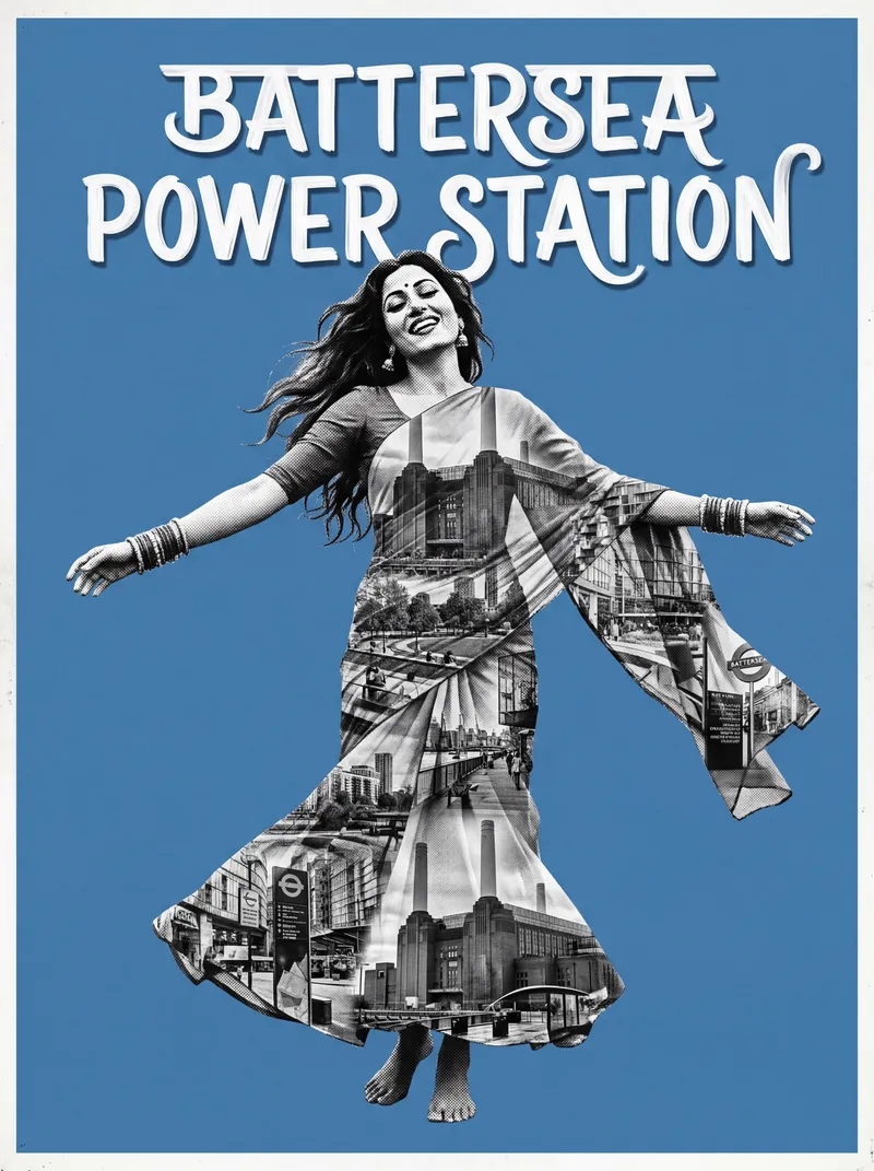
Our Battersea Power Station poster — brutalist architecture meets Bollywood colour.
Why It's Happening Now
Three things are converging in 2026:
Diaspora identity is front and centre. British-South Asian culture isn't niche anymore — it's mainstream. From food to fashion to film, desi influence is everywhere. Homes are catching up. People want decor that reflects who they actually are, not a Pinterest board from 2016.
Colour confidence is back. Farrow & Ball launched their boldest palette in years. Dulux's colour of the year is a warm terracotta. Instagram interiors accounts with actual colour in them are outperforming the all-white flat-lay aesthetic. The market has shifted.
Personality over perfection. The "curated" look is giving way to the "collected" look. People want art with a story, a place, a cultural reference — not something that exists purely to match the sofa cushions.
How Fusion Brutalism Works in a UK Home
The beauty of this aesthetic is that it doesn't need a full room makeover. One piece of brutalist Bollywood art against a neutral wall creates enough contrast to anchor an entire room. It works because British homes tend toward cool, muted interiors — and warm, high-contrast art cuts through that like a spotlight.
In a modern flat: The hard geometric lines of our posters echo the clean architecture of new builds. A Canary Wharf poster on a white wall in a Docklands apartment — the brutalism talks to the building, the Bollywood colour warms it up.
In a Victorian terrace: The ornate mouldings and picture rails of older homes contrast brilliantly with hard-edged art. Our Angel or Highgate poster in a period property creates a tension between old and new that makes both elements more interesting.
In a rented space: Unframed posters at 24×36" give you maximum colour impact for £39.99. Command strips, no drilling, no deposit issues. We've written a full guide on wall art for rented flats.
The Burnt Orange and Burgundy Palette
Colour trends in home decor tend to move in cycles. After a decade of grey, blush pink, and sage green, the direction for 2026 is unmistakable: warm, bold, earthy.
Our core palette — accent orange and wine burgundy — sits right at the centre of this shift. These aren't colours we chose to chase a trend. They come from the source material: vintage Bollywood cinema posters from the 1960s and 70s, when hand-painted film hoardings used burnt orange, deep red, and gold because those colours grabbed attention from across a crowded Mumbai street.
The fact that mainstream interiors are now arriving at the same palette is timing, not coincidence. The colours work because they're warm, emotionally charged, and they play well against the cool grey light that comes through British windows nine months of the year.
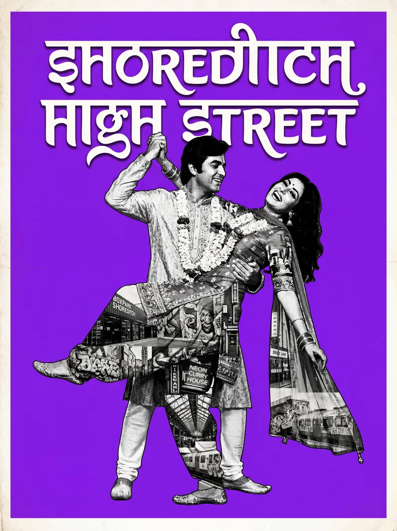
Our Shoreditch High Street poster — East London edge meets Bollywood warmth.
Sizes That Make the Statement
If you're buying into the trend, go big or don't bother. A brutalist Bollywood poster at 8×12" is a nice accent. At 24×36", it's a wall feature. The whole point of this aesthetic is confidence — give it room to breathe.
- 24×36" unframed (£39.99): The full experience. This is the size that changes a room.
- 16×24" framed (£69.99): The "I know what I'm doing" choice. Black frame, hard shadow, clean lines. Gallery-ready.
- 8×12" framed (£49.99): Best in pairs or threes. Build a collection over time — one poster per neighbourhood, per trip, per memory.
Pro Tip: Start with one 24×36" poster in the room you spend most time in. Live with it for a week. If the room feels more alive (it will), add a second piece in a different room. Building a collection gradually is more satisfying — and easier on the wallet — than buying everything at once.
What Comes After Minimalism
The short answer: meaning. Art that connects to a place, a culture, a memory. Decor that says something about the person who chose it, not just about their colour scheme.
Brutalist Bollywood is one expression of that shift. It's design with roots — in the concrete poetry of post-war architecture, in the emotional excess of Hindi cinema, in the British-South Asian experience of holding two cultures at once and making something new from both. That's what makes it more than a trend. Trends cycle. Identity doesn't.
What is brutalist Bollywood design?
Brutalist Bollywood combines the raw geometric honesty of brutalist architecture — hard edges, thick borders, block shadows — with the saturated colour palette and emotional drama of vintage Bollywood cinema posters. The result is art that's bold, warm, and structurally confident.
What are the biggest wall art trends for 2026 in the UK?
The major shift for 2026 is from muted minimalism toward bold colour, warm earthy tones (burnt orange, burgundy, terracotta), personality-driven art, and cultural references. Diaspora-inspired decor and fusion design styles are increasingly mainstream.
Does bold, colourful wall art work in neutral UK interiors?
Yes — neutral walls are the best backdrop for bold art. The contrast between warm Bollywood-style colours and cool British interiors (white, grey, magnolia) makes both elements look better. One statement piece can anchor an entire room.