You've spent actual money on wall art. It arrived, you hung it up, stepped back — and something's not right. The room still looks like you moved in last week. Nine times out of ten, it's not the art. It's one of these five mistakes.
1. Hanging It Too High
This is the single most common wall art crime in British homes. You eyeball it, hammer in the nail, and end up with art floating near the ceiling like it's trying to escape.
The fix is dead simple: centre of the artwork at eye level — roughly 150cm from the floor. If you're hanging above a sofa or bed, leave a 15–20cm gap between the top of the furniture and the bottom of the frame. That's it. Your art should feel connected to the furniture below it, not hovering in no man's land.
2. Going Too Small for the Wall
A tiny print on a big wall looks like a postage stamp on an envelope. It doesn't matter how good the art is — if it's dwarfed by empty space, the room reads as unfinished.
Use the two-thirds rule: your art should be roughly two-thirds the width of whatever furniture sits below it. Above a standard three-seater sofa? You want something 100–120cm wide. That's a single 24×36" poster or a pair of 16×24" prints side by side. Our poster sizing guide breaks this down room by room if you want the full maths.
3. Skipping the Frame
Look — we sell unframed posters and they have their place. In a bedroom, a home office, rotated seasonally. But if your living room centrepiece is a poster held up with blu-tack and slightly curling at the corners, that's the thing dragging your room down.
A frame does the heavy lifting. It tells everyone who walks in that the art was a choice, not an afterthought. Even a basic black frame transforms a print from "student digs" to "someone who owns a cheese board." We go into the full framed-vs-unframed decision in our framing guide.
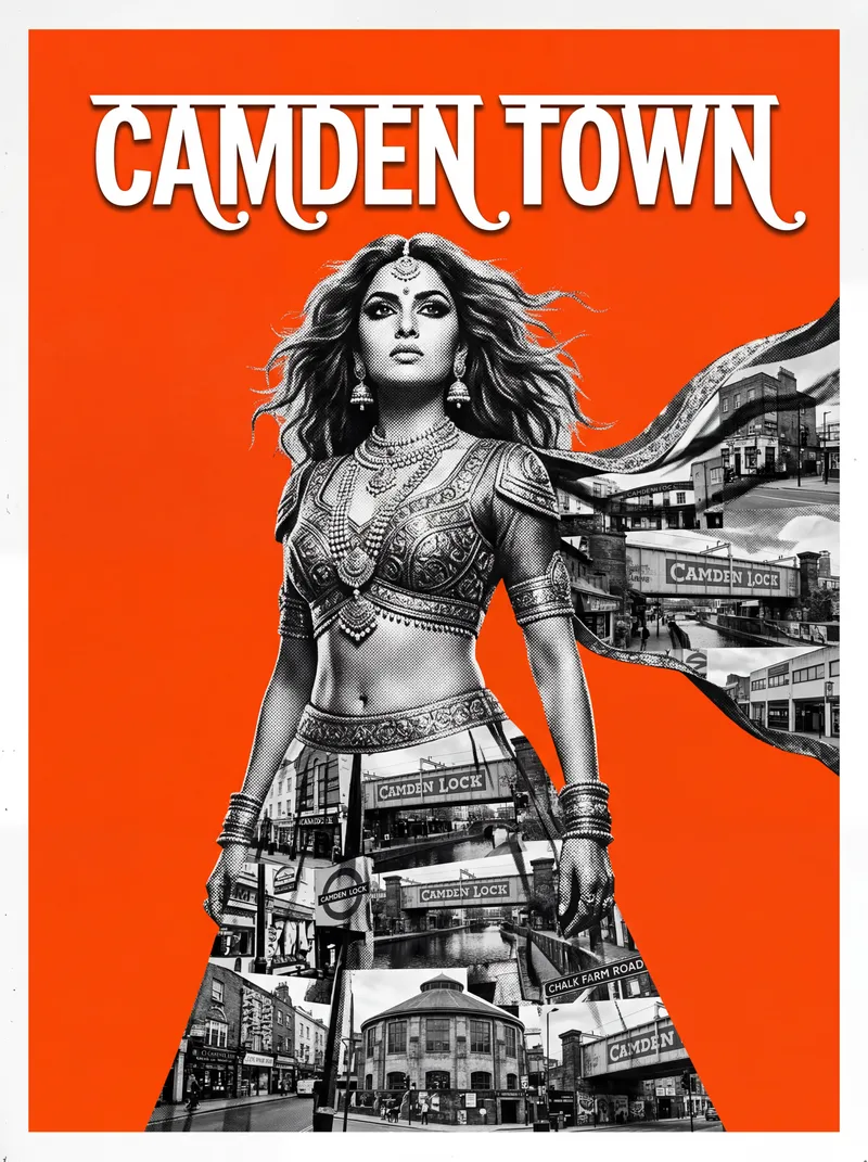
Our Camden Town poster — framed, it anchors a room. Blu-tacked, it anchors nothing.
4. Ignoring the Lighting
You could hang the Mona Lisa in a dark corner and it'd look like a charity shop find. Lighting is half the reason art works in a space.
Position your art where natural light actually reaches it — near a window, on a wall that catches afternoon sun. For evenings, a warm-toned picture light above the frame costs under £20 and makes a £25 poster look like a £200 print. Even angling a floor lamp toward the wall helps. Colourful art like a Bollywood-style Oxford Circus poster comes alive under warm light — the oranges and golds glow instead of going flat.
5. Playing It Too Safe with Colour
Matching your art to your cushions is the interior design equivalent of wearing a matching tracksuit — technically coordinated, zero personality. Your room ends up looking like a catalogue showroom where nobody actually lives.
Bold art against neutral walls is where the magic happens. Most UK flats have white, grey, or magnolia walls (thanks, landlords and developers). That's not a limitation — it's a blank stage. A Piccadilly Circus poster in burnt orange and wine tones against a white wall creates the kind of contrast that makes people stop and look.
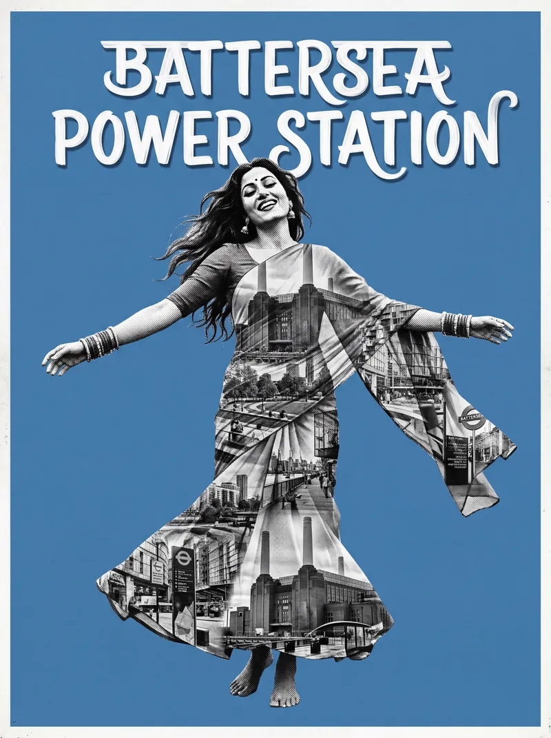
Our Battersea Power Station poster — bold colour against neutral walls, exactly how it should be.
Don't pick art that blends in. Pick art that stands out and let the room breathe around it. If you're building a gallery wall, the colour thread should run through your pieces — but it shouldn't match your paint swatch.
Pro Tip: Before you drill, cut a piece of newspaper or brown paper to the exact size of your poster and tape it to the wall with painter's tape. Live with it for a day. Check it from the sofa, from the doorway, in daylight and at night. This two-minute trick saves more holes — and regrets — than any measuring guide.
What height should I hang wall art?
Centre of the artwork at 150cm from the floor — that's eye level for most people. Above furniture, keep a 15–20cm gap between the top of the sofa or bed and the bottom of the frame. If it feels too low, it's probably right. People almost always hang too high.
What size poster is best for a living room?
For above a sofa, 24×36 inches as a single statement piece or two 16×24 inch posters side by side. The art should fill roughly two-thirds the width of the furniture below it. Anything smaller and the wall swallows it.
Does wall art need to match the room's colour scheme?
No — and trying too hard to match is one of the most common mistakes. Art should contrast with your walls, not blend into them. Bold, warm-toned art against neutral UK walls (white, grey, magnolia) creates far more impact than perfectly colour-matched prints.